Rostock (D) - February 14th 2012
In general when I travel I take care to have with me at least a Fude pen and a camera.
Even when - like this time - I am traveling for business reasons. The idea is that I can often find at least something worthwhile to take pictures of (usually true) and that there is always a bit of free time to practice a bit of ShoDo (usually false - mostly because I get distracted, I am too tired or do something else, in case I have some free time to start with).
Anyway this time I had no pen, obviously no brushes, and no camera, either.
What I had was:
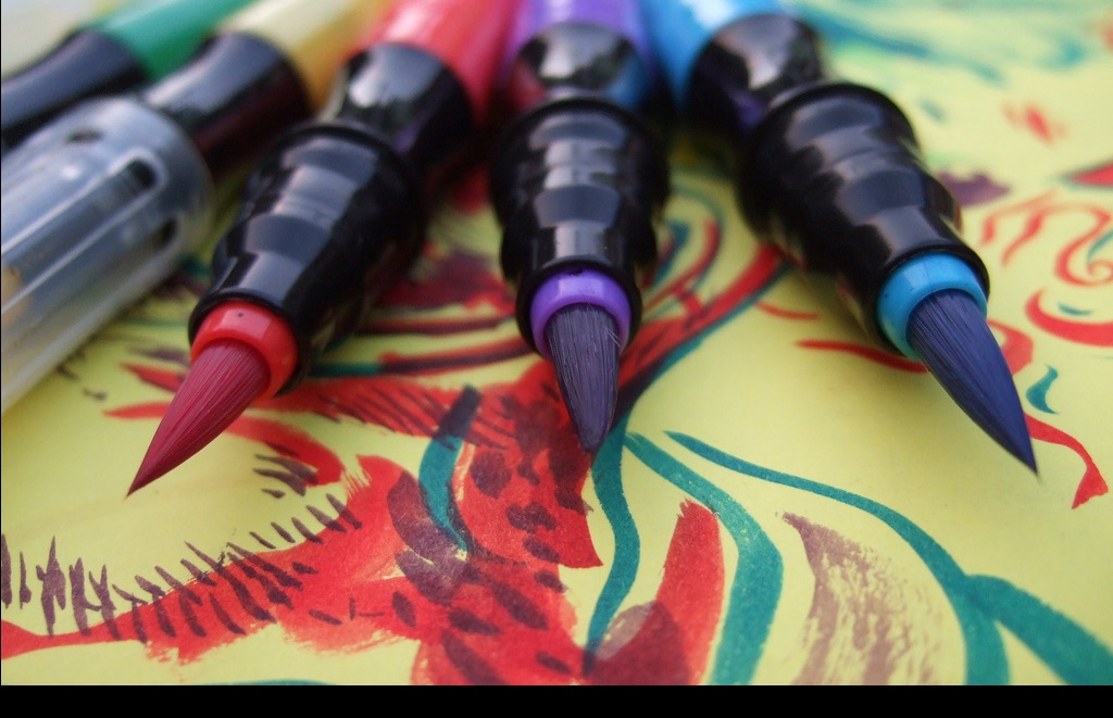
A set of Crayola "Paint Brush Pens" bought in an airport store during a previous trip - these have, in fact, a "brush-like" tip, and I bought them to play a bit with colors, but I also soon discovered that these are not flexible enough to properly replace a brush, even a synthetic one.
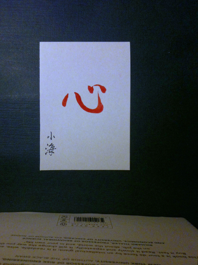
I also had a Fabriano notebook which I bought in the same airport, on a different trip. The idea was to get something to write down notes during meetings - and still being nice enough that it work for ShoDo, too, but the real reason is that I am a sucker for stationery and related goods.
You can see it in the background, it's the blue thing.
It's gorgeous, with creamy, cloth-like paper. It's really wasted for just taking throwaway notes during meetings, or sketching system architectures on it.
A set of Crayola "Paint Brush Pens" bought in an airport store during a previous trip - these have, in fact, a "brush-like" tip, and I bought them to play a bit with colors, but I also soon discovered that these are not flexible enough to properly replace a brush, even a synthetic one.
I also had a Fabriano notebook which I bought in the same airport, on a different trip. The idea was to get something to write down notes during meetings - and still being nice enough that it work for ShoDo, too, but the real reason is that I am a sucker for stationery and related goods.
You can see it in the background, it's the blue thing.
It's gorgeous, with creamy, cloth-like paper. It's really wasted for just taking throwaway notes during meetings, or sketching system architectures on it.
Pic is originally from "monocat" on www.flickr.com
And instead of a proper camera, I had with me my trusty (but resolution-poor) iPhone 3GS.
Normally this is not a problem, but it may become one if you are stranded in a foreign country on February 14th, want to prepare a Valentine for someone, you have little free time and absolutely no command of German to go out and ask someone where to buy a brush, some ink and maybe a scanner.
The scanner would be useful because, you see, while the hotel is quite nice, for some reason they have opted for a very soft lighting setup.
So I was quite sure that my iPhone would struggle to get the picture right… and for traditional reasons I didn't want to wait for the day after to send my work, even if the morning light would have helped.
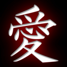
Most people would probably opt for "愛" (Ai, i.e. Love) but I opted for "心" (Kokoro, i.e. "Heart" instead). The reason is twofold. First of all, most "traditional" Valentine cards have hearts on them. Plenty of hearts. "Kokoro" is not necessarily the right ideogram, because it conveys more of a sense of "inner spirit" than love or friendship.
But I liked the idea, and also, this ideogram, albeit it looks simple to write, is particularly challenging, at least for me.
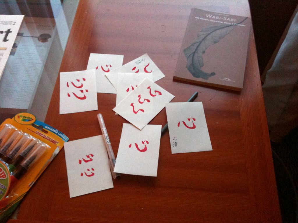
The other thing I decided was that the actual writing should be quite small, because the pens I had with me have relatively small tips, so there was no chance to write anything in "normal" format.
I dutifully cut one of my Fabriano sheets in 8 parts, fired up my Mac to look at inspirational writings and started working.
Of course "black" was not available as a color from my small selection of pens, but that was not a problem, anyway, because nothing says "Valentine" like something written in red…
In the picture you can see the final result (this I took the morning after, so the colors are "acceptable"). Some were just to warm myself up (and also to experiment which version of the ideogram to select, between the various styles).
In the end I selected a semi-cursive version.
Of course I didn't have a proper hanko, either. But in this case I think this was not much of a problem, because chromatically having another red element would detract from the final result.
So I just signed it with a very fine-tipped black pen.
And now the real problems started. Because I said, light was too low for my iPhone, and I didn't have anything to stabilize it when taking the picture. I have a couple of apps that help reducing the "trembling" but even with those the results weren't encouraging.
In the end I built a sort of "stand" so that I could lean the phone against it while taking the picture. The result wasn't too bad, in terms of blurriness, but the colors were way off.
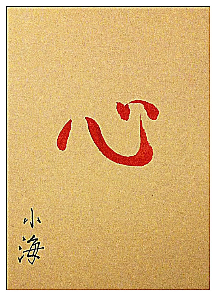
I selected the one with the better resolution, cropped it and did some post-production directly on the iPhone itself, mostly using Adobe Photoshop Express
The paper "tone" came out as much darker than in reality, but somehow this works - it reminds me of mica accented paper used in the East for decorative purposes.
Using the same app I added a small frame so that the final result was closer to a shikishi in looks.
All in all, considering the pretty dire conditions I had to work under, I am quite pleased with the result.
I have read and seen pictures of ShoDo masters being able to improvise magnificent calligraphy works out of basically anything, including using granatine syrup instead of ink or a crumpled kleenex instead of a proper brush.
I don't pretend this to be even remotely comparable: the real sign of mastery is to be able to produce great calligraphy at the first attempt, no matter what the situation is - and as you can see I need at least eight attempts even to get to "mediocre".
But I am still proud of having shown a bit of resourcefulness, and I believe that the final result, defects and all, captures what the real spirit of a "Valentine" should be, for me.
Not too much, not too little.